
Design Iterations
The first step in the design process was to create a user journey to
bring more clarity to the process and the app’s navigation design
Step 2 - Initial Site Map
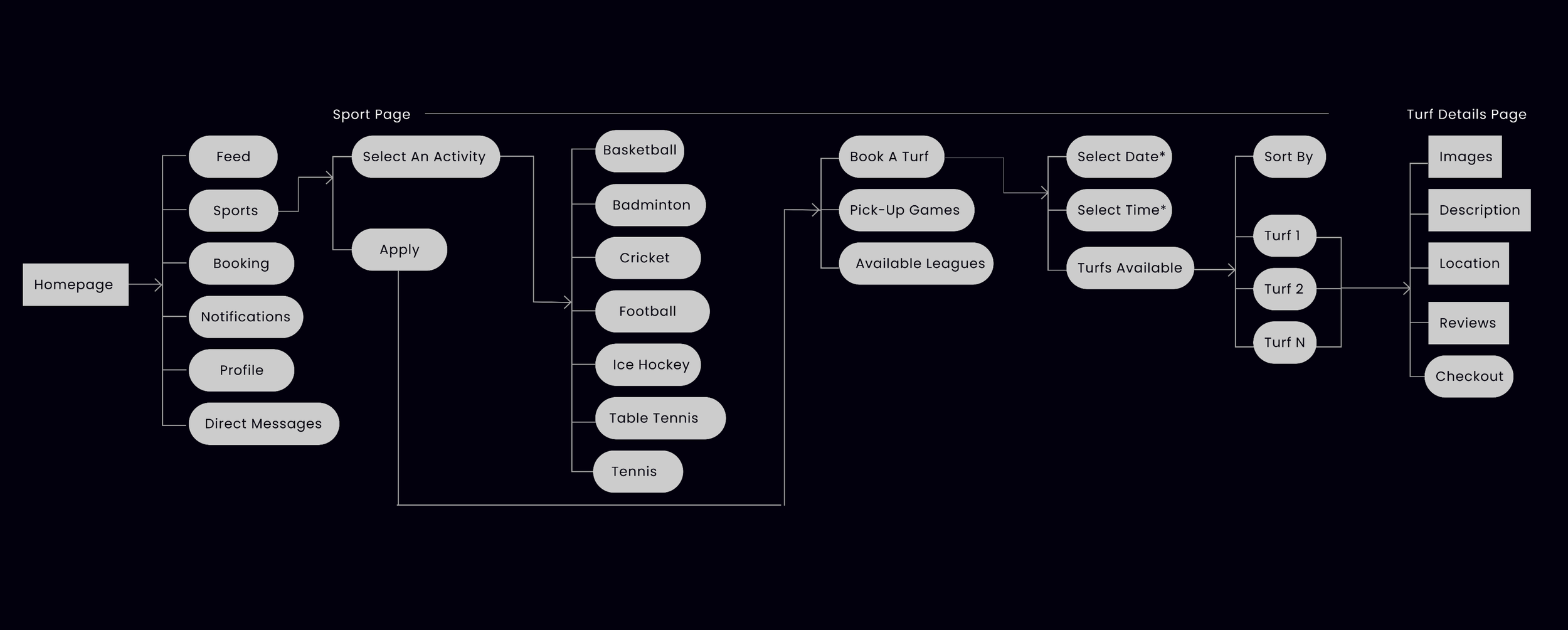
The next step was to create the first version of the app’s Information Architecture
Step 3 - Wireframe Concepts
On having a much better idea of how the navigation would work, the next process was to convert it into screens
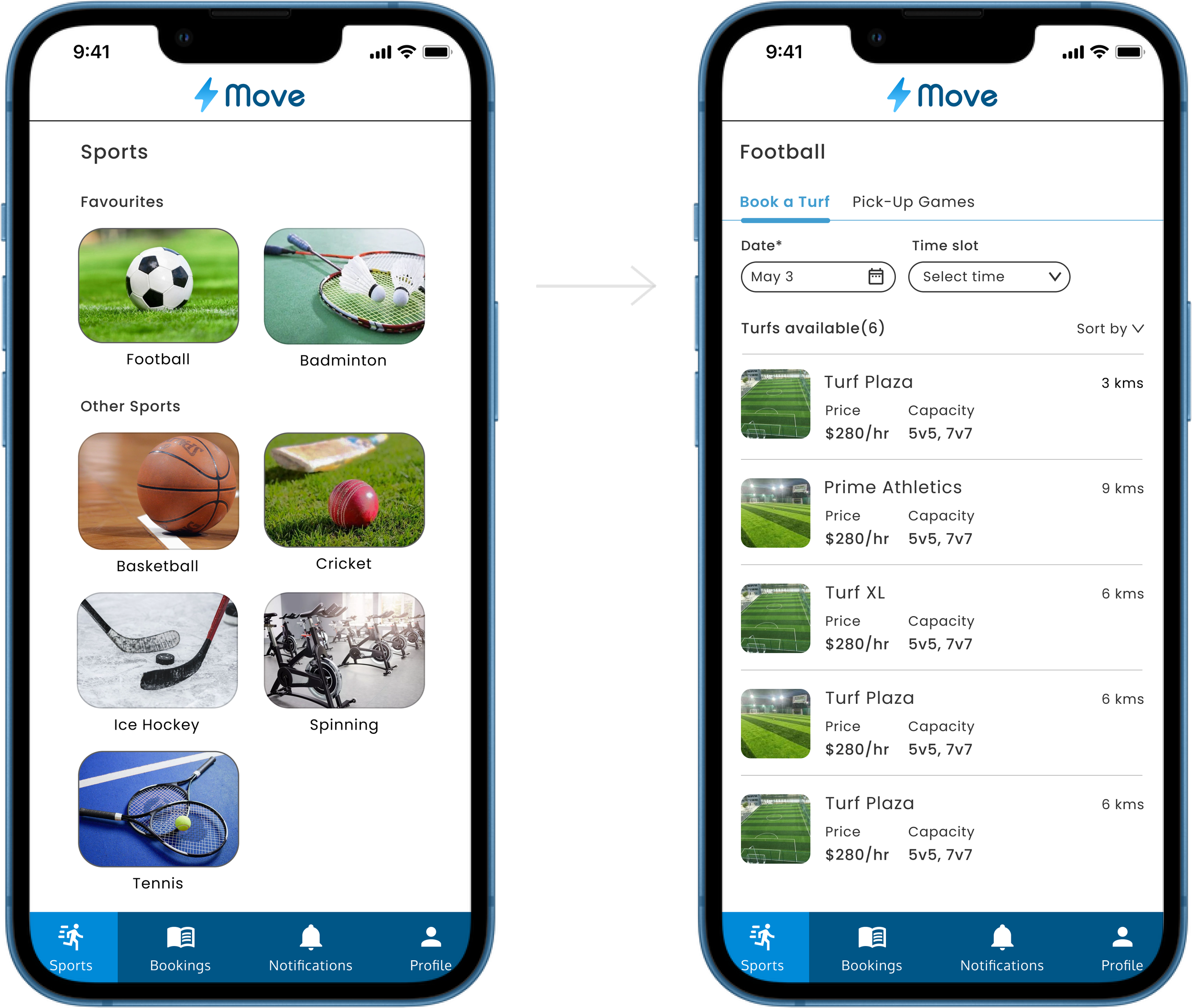
Concept 1 - Simple and easy navigation
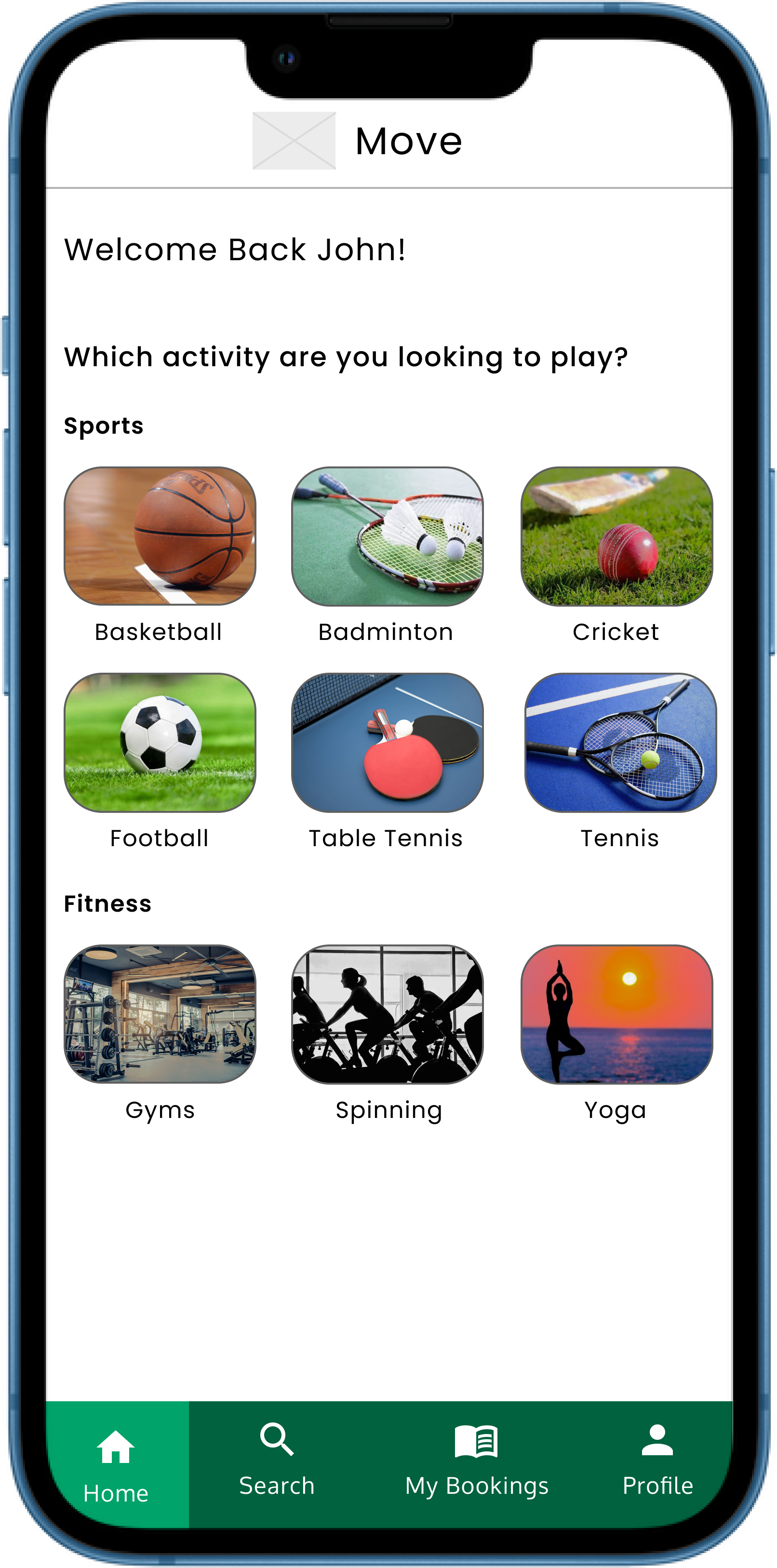
About the Design
On the homepage, the user can select the sport
/Activity and find information about it on the next page
Advantages
• Low cognitive load and learning curve
• The app has more activity options to offer
(includes sports and fitness activities)
Areas of Improvement
• The user journey could be a little lengthy
• No personalization
Concept 2 - The All in one page
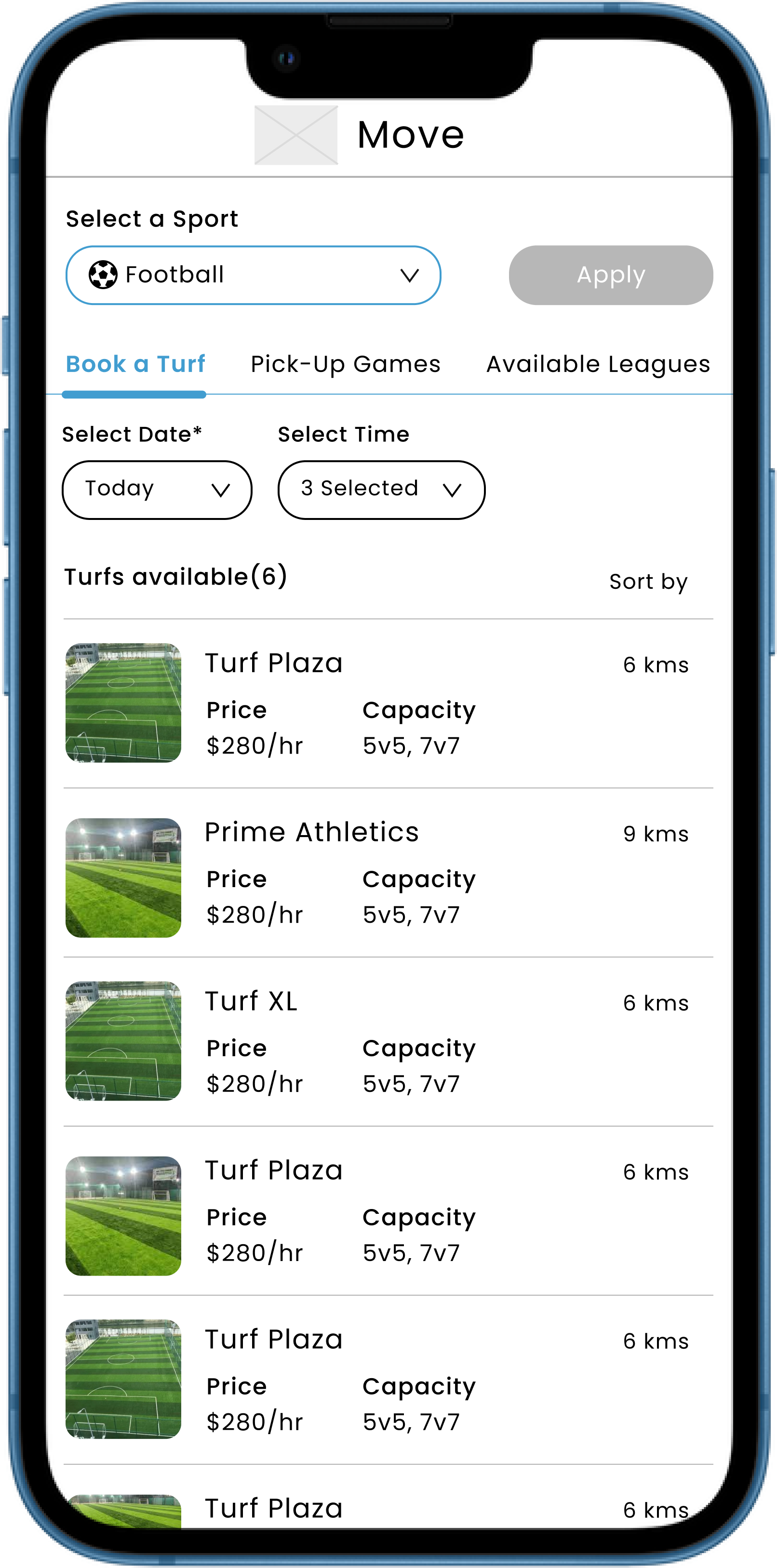
About the Design
On selecting a sport, the user can find all
the information on the same page
Advantages
• All the information regarding the sport selected
by the user is available on the homepage itself
• Clear and precise Information Hierarchy
• The user journey is quick/short
Areas of Improvement
• The cognitive load might be high for
some users/Increased learning curve
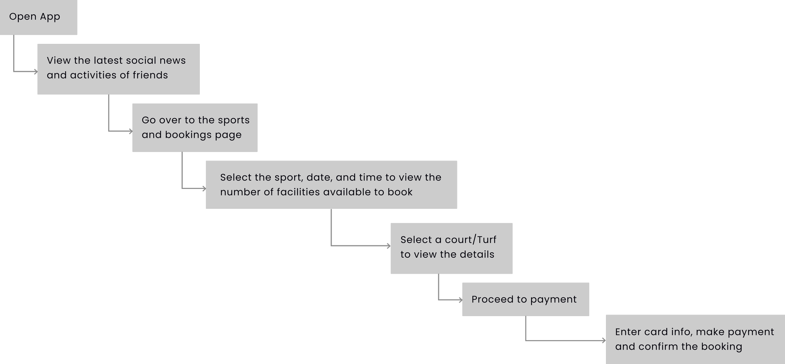
Step 1 - The User Journey
Move! - Encouraging regular sports participation
Concept 3 - Social Networking focused
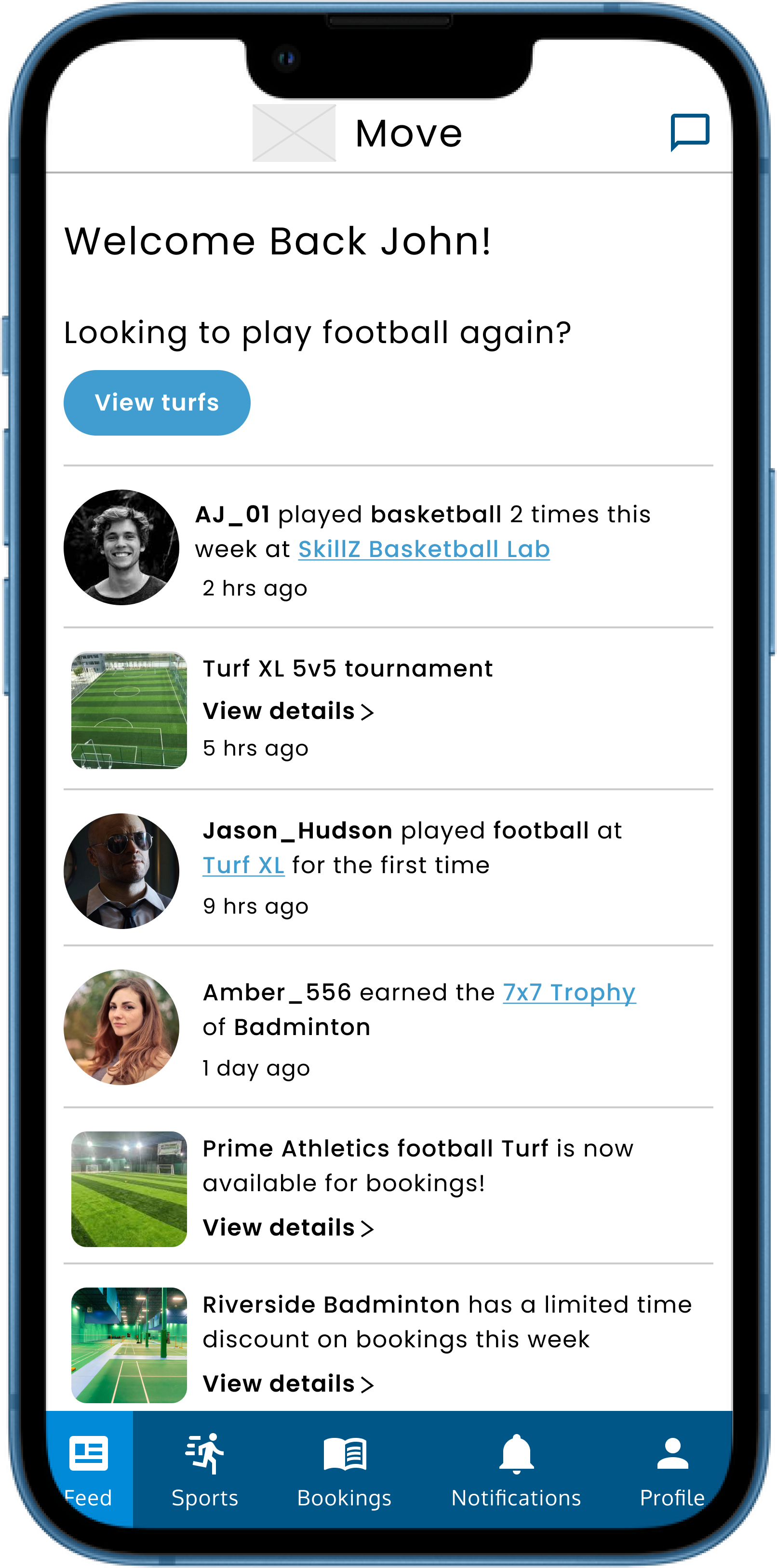
About the Design
The app provides a social networking element,
making it more interesting along with the main
function of booking a sports facilities
Advantages
• A social feed feature providing updates about friends’
activities, as well as information regarding new facilities
• A Gamification element that provides users with
awards and achievements for regularly engaging in
sporting and fitness activities
• Having the main tabs at the bottom
that provides more ease of use
Areas of Improvement
• The Social feature might be a little distracting,
taking the users away from the main function
i.e. booking sports facilities
• Relatively high cognitive load/high learning curve
Step 4 - Final Concept selection
After analyzing and discussing the design iterations with fellow UX designers and my supervisor,
I finalized the first option as it was the best in terms of functionality, low cognitive load, and ease of use
I also updated the visual design of the screens to resemble the finished product